
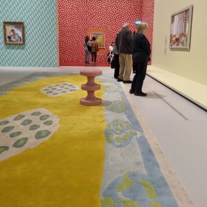
Inspiration can come in the most unlikely of places. The recent Pierre Bonnard designed by India Mahdavi was layered with colour and pattern. I adored it.
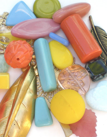
These are the beads we selected from the colour inspiration we gleened from the exhibition. What a combination of colours!
Colour is the aspect of design I enjoy the most – it is your stamp or expression of your individuality. It is also true to say most of my students will express a love/hate relationship with colour. For some choosing and matching colours seems remote and abstract which can be overwhelming without some guidance or training in colour.
Countless opportunities to use colour confront us every day: what we wear, how we choose to decorate our homes and how we use it in our hobbies including designing jewellery.
The main problem is the huge leap of imagination from seeing the range of colour before us and interpreting that or visualising it in our creations. Some people play it safe with something undoubtedly tasteful but possibly unadventurous. Fear of getting it wrong is often why many of us stick to using safe colour combinations.
Where Do You Start?
A great starting point is the type of person you are and think about your style and personality. Then build on that.
What colours are you attracted to?
- pastels? (icey blue, dove grey, lilac, lemon, pistachio)
- brights? (emerald, fuchsia, turquoise, berry red, royal)
- warm muted? (olive, tomato red, musters, sea green, rust, peach)
- mid tones? (aqua, coral, mid green,)
Top 10 Colour Tips:
These are my tips which will give you the confidence to start to explore and to experiment with colour. Certainly, personal preference is always a good starting point.
- The first “rule” is to go with the colour you love wearing.
Where only one hue (colour) is used the colour combination is called monochromatic.
There isn’t just 1 shade of blue but navy, turquoise, cornflower, royal, sapphire & cobalt for example.
Use the entire spectrum of one colour, for example red: from rose pinks, deep maroons, berry reds and lipstick red. The result of unity, depth and vividness could not be achieved in any other way.
This is the easiest and most successful way of working with one colour.
- Use a multi-coloured bead or pendant to inspire your colour palette.
- Add black or white to your favourite colour.
- Add metallics. For an instant opulent, vintage, or dramatic statement add gold, bronze, silver or gunmetal.
- Consider colour temperature: i.e., cool colours or warm colours.
- Decide on a dominant colour if you are using 2 or more. (60 30 10 principle)
- Start looking at colour differently. The colour of your visual memory, personality, and a scarf or lolly wrapper can all be sources of colour combinations. Learn to look around you and you will start to notice whatever catches your eye will give you inspiration. Capture a moment of inspiration on the camera of your mobile phone.
- Check out Pinterest mood boards online for others inspiration. (pinterest.com)
- When using different colours achieve a cohesive look by selecting tones with similar “values” in the colour spectrum
e.g., yellow and mid grey, plum and navy, pumpkin and candy pink, chartreuse and aquamarine.
- Organise colours according to the colour wheel. This is a traditional visual device for representing the colour spectrum and demonstrating the relationship of the colours with one another. Its origin lies in the different wavelengths of light that produce the colours we see in a rainbow.